
Lead Product Designer: owned problem framing, research synthesis, and end-to-end flow design; aligned Research, Operations, Legal, Engineering, and CRM to ship it
Kantemir, PM - business alignment
Alessio, EM - technical feasibility
Christina, CRM Manager - cross-channel coordination
Ana & Olga, UX Researchers - customer research
Claude, Claude Design, Figma
1. Defining
the problem

2. Research
3. Design & prototyping
4. Refinement

petolo is a health insurance provider for cats and dogs.
The goal of this project was to reduce churn among newly acquired customers by demonstrating the value of the product and creating an emotional connection with it, partly by adding a photo of the customer's pet to their profile.
We observed that roughly 25% of new customers withdraw or cancel within the first 3 months of signing up, meaning lost revenue. We wanted to find a way to keep them.
A thorough analysis of customer data, combined with qualitative research (survey and interviews run by the UX Research team), showed that 17.9% of cancelling customers cited the insurance as "too expensive". Following up on this clue, we discovered that what is often meant by that is not lack of afforability but low perceived value. This is why we decided to increase product adoption by activating customers to use petolo, so they could see for themselves how much they save with the coverage.
The hypothesis:
If we encourage customers to make their first claim for a prevention treatment (typically fast and cheap to process for us, low-friction to pay out), we demonstrate the value of the product and keep the customer loyal. By letting them upload a photo of their pet, we create an emotional bond to what is otherwise a "dry" product.
Looking at the sitemap of the petolo account area, I noticed we weren't using our onboarding flow to its full potential. It was a set of simple slides, generic and skippable.
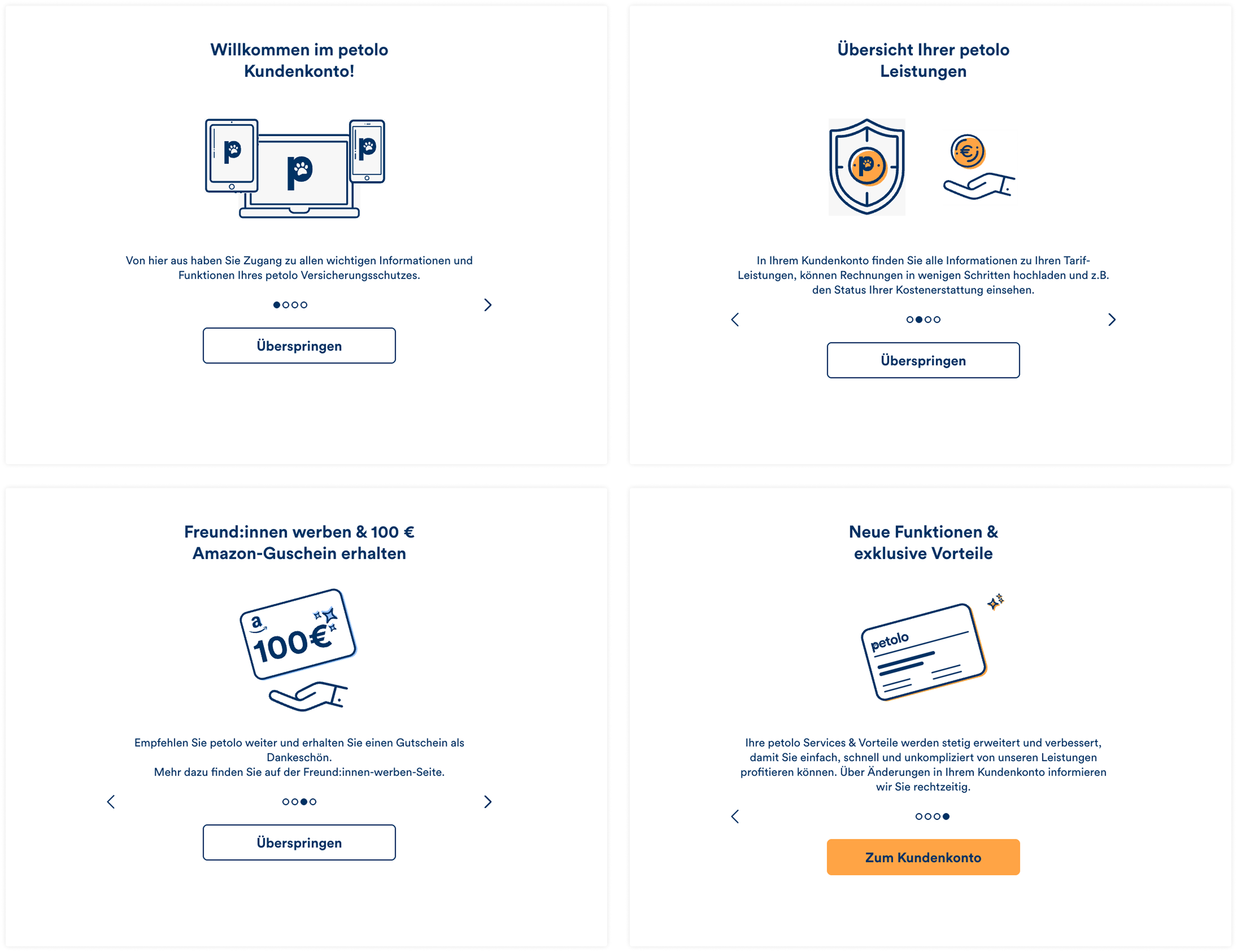
Initial petolo onboarding flow
Opportunity:
Redesigning this experience to be more interactive and responsive to user needs could increase engagement with the product.
We joined forces with the CRM squad, who were designing an email sequence for new customers. The goal was to understand their planned schedule and how it should connect to the account area.
What I noticed:
CRM was starting work on an onboarding email sequence for new customers, a separate touchpoint from the account area.
Opportunity:
We coordinated early to design both as one system instead of two disconnected experiences. The day-one email invites the customer to log in and routes them straight into the onboarding flow, and the claim-encouragement emails only send as long as the customer hasn't made one within the first 3 months. Each flow still had to make sense read on its own, since not every customer reads both, but neither would repeat what the other already said.
To start the design phase, I used a Claude Skill I'd built, fed with all our existing customer research (personas, surveys, interviews, competitive research, A/B test results). I already had my own idea for solving the problem, so I described it and "discussed" it with Claude, which I treat as a virtual design assistant. That back and forth surfaced initial caveats and refined the idea into a design brief.
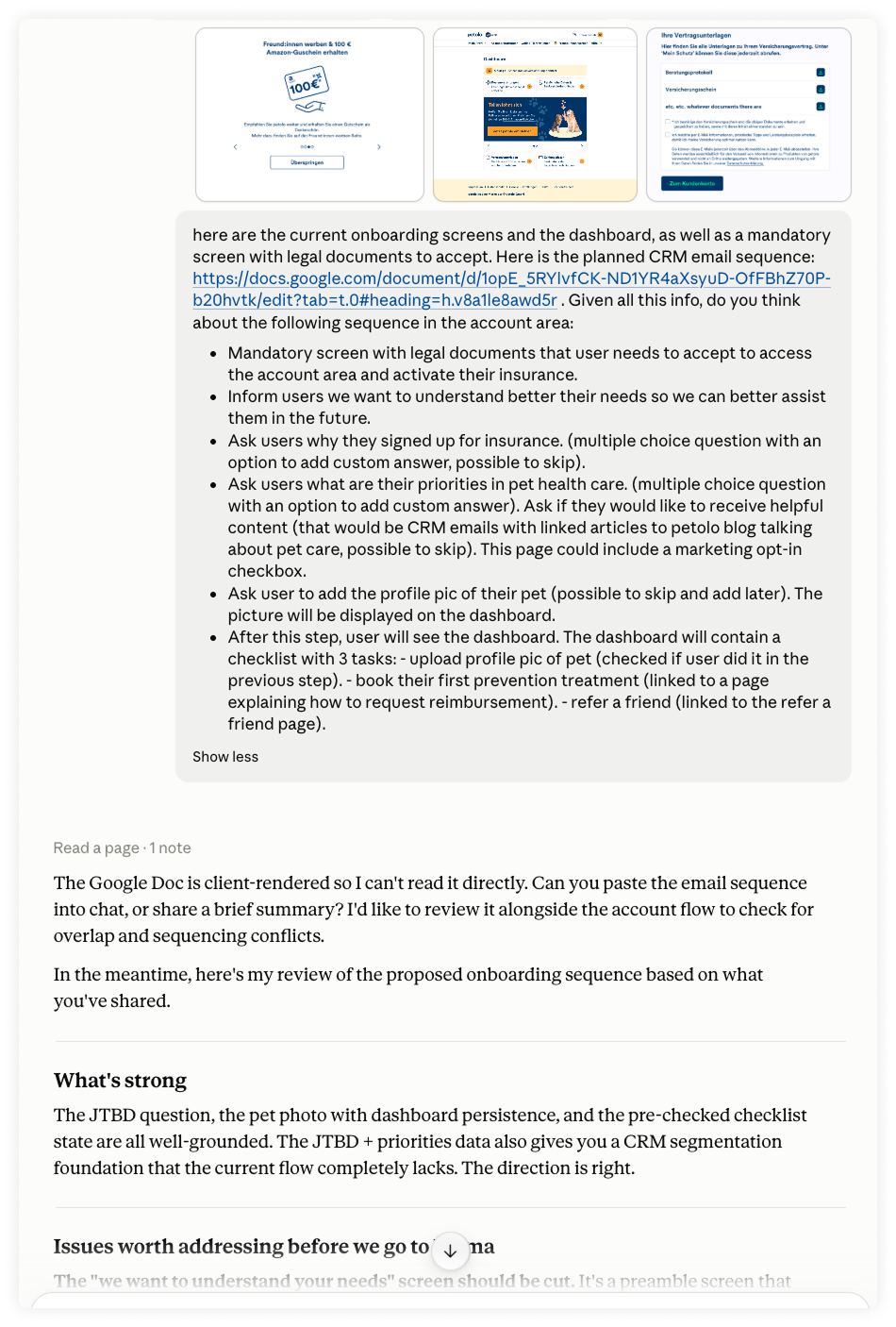
Example of brainstorming session with Claude
To avoid hallucinations, I instructed the Skill to cite its sources so I could manually check the data if needed.
I passed the brief to Claude Design, already fed with our design system, which visualised the idea. The wireframes had inconsistencies and usability issues, but were a solid starting point, and already included interactions, which helped illustrate the flow to engineers.
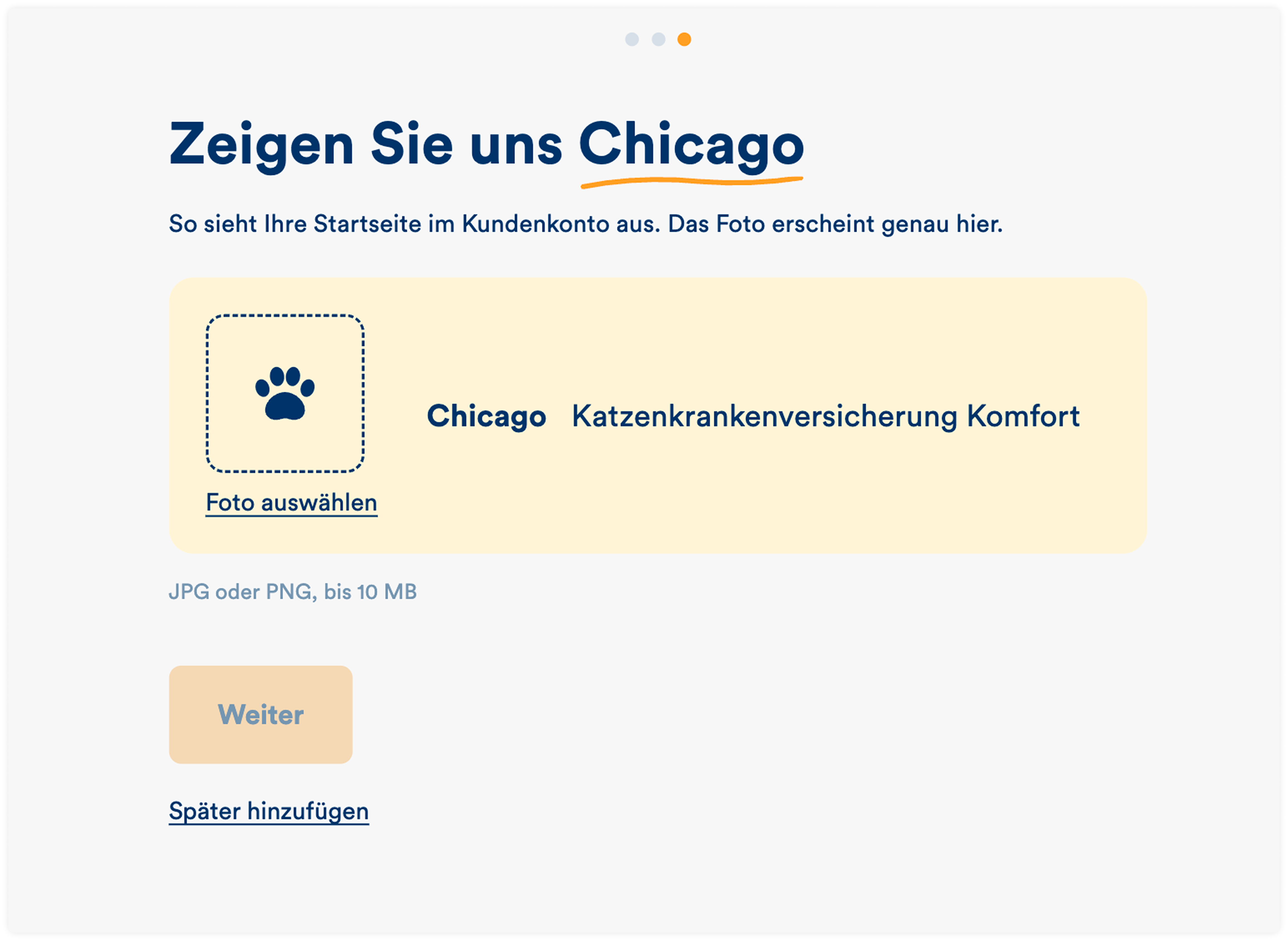
Initial wireframe of the Photo upload step designed by Claude
I moved the designs into Figma and documented all my thinking and comments there.
The proposed onboarding flow had 4 steps, and each of them needed its own round of input from stakeholders around the company:
I then integrated input from across the team into a complete flow of screens, with interactions and dependencies described.
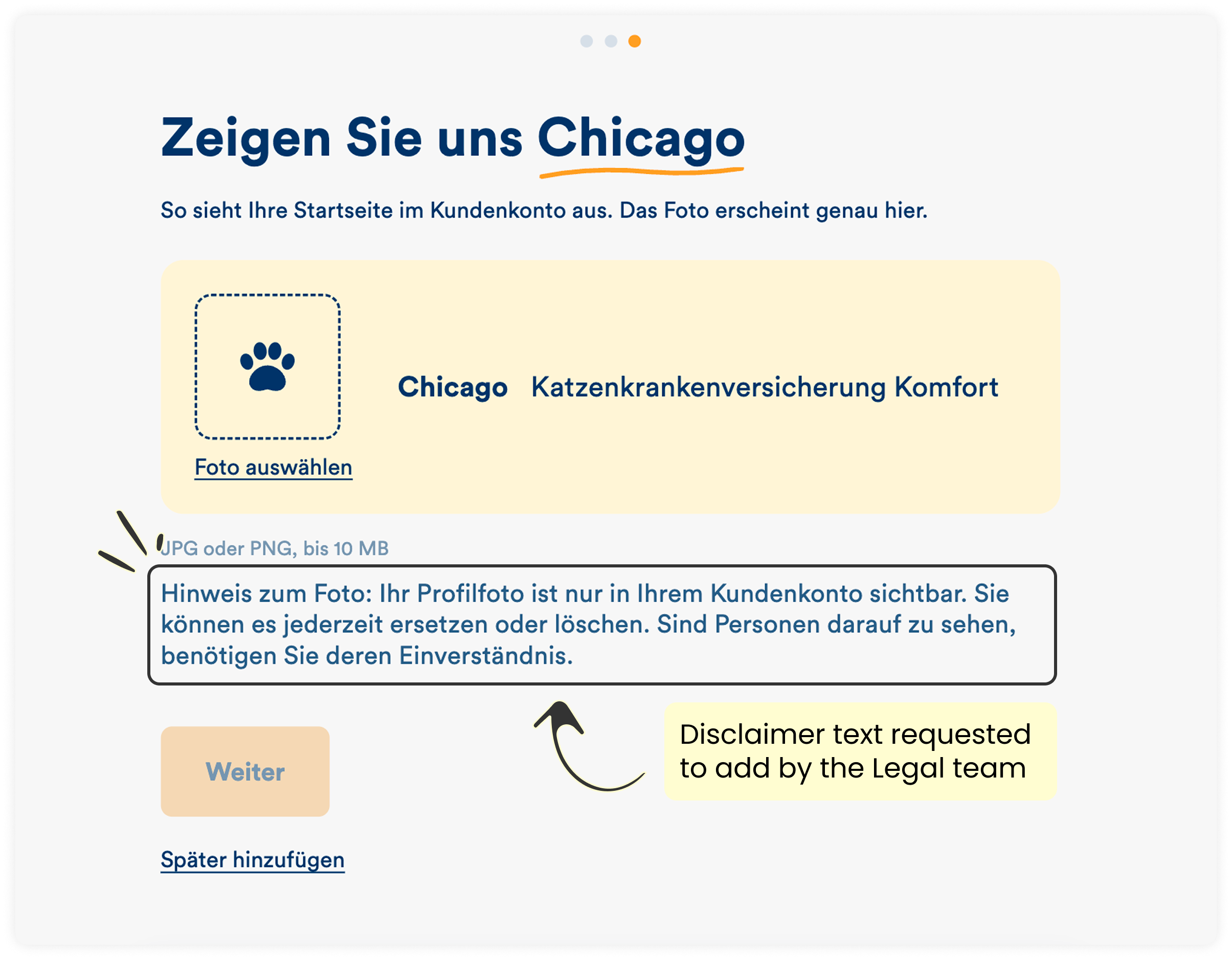
Example of a change made after a consultation with the Legal team
I brought the refined designes to our engineering team and the PM, who gave me feedback of the complete flow. It did not only includ technical feasibility, but also touched an important usability question.
Getting feedback is one of the most valuable parts of the process for me. It casts new light on the problem and helps me improve the solution.
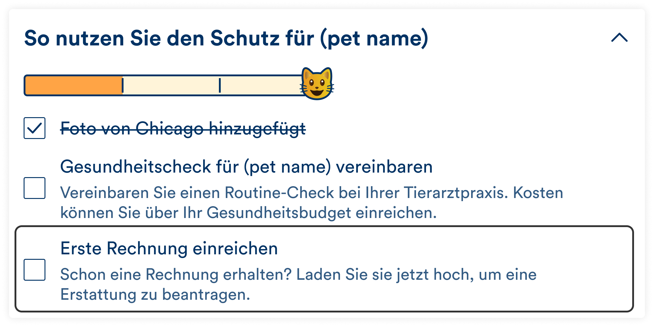
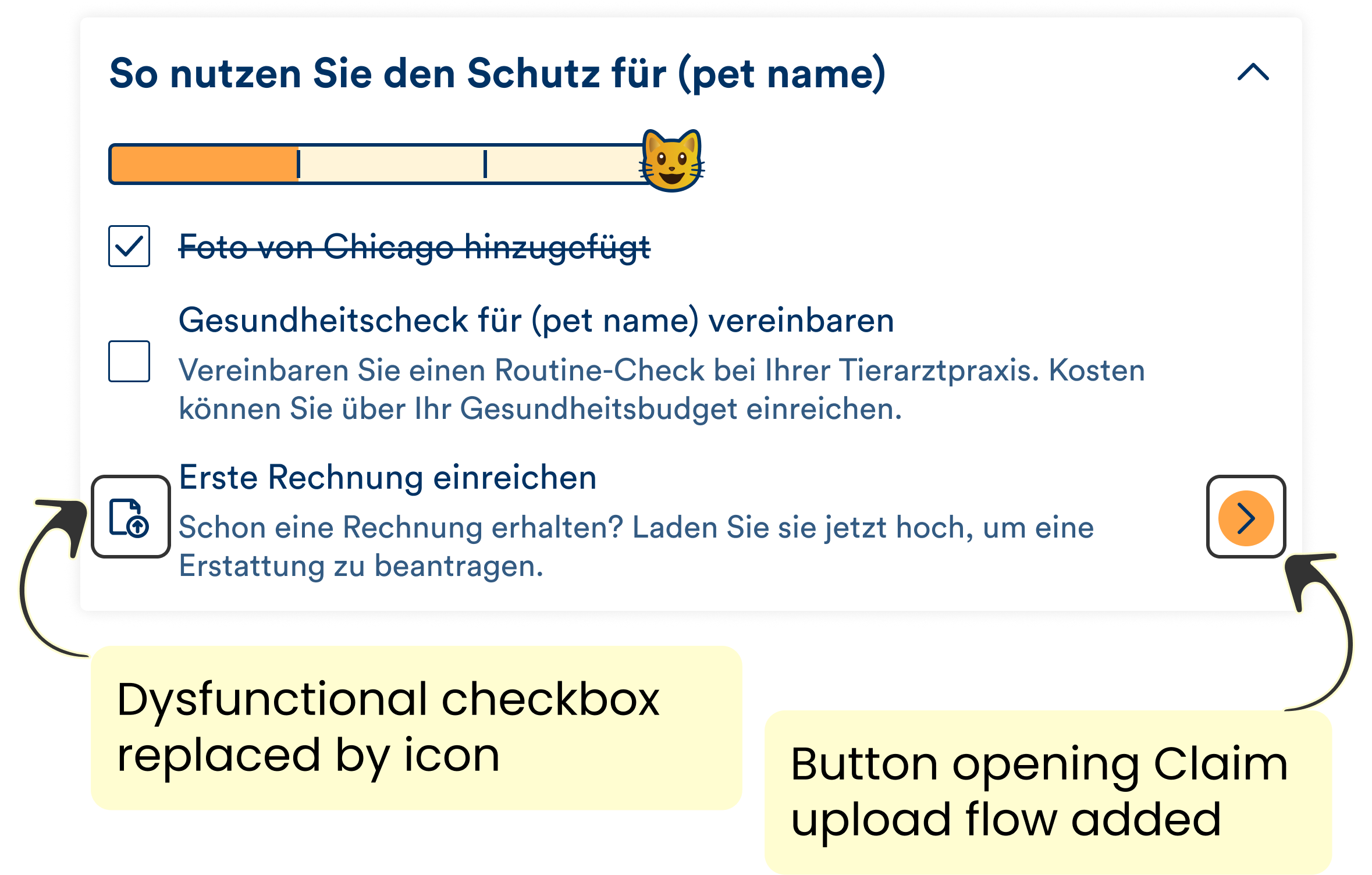
One engineer caught a gap in the logic: step 3 of the checklist (uploading a claim) was designed as something the user checks off manually, but the system already recognises automatically when a claim is made, so users shouldn't be able to check it themselves.
I reworked the onboarding checklist's third item based on that feedback: instead of a checkbox, it's now an icon for document upload with a button that leads directly into the claims flow. I also replaced the design elements Claude Design had generated that didn't match our design system.
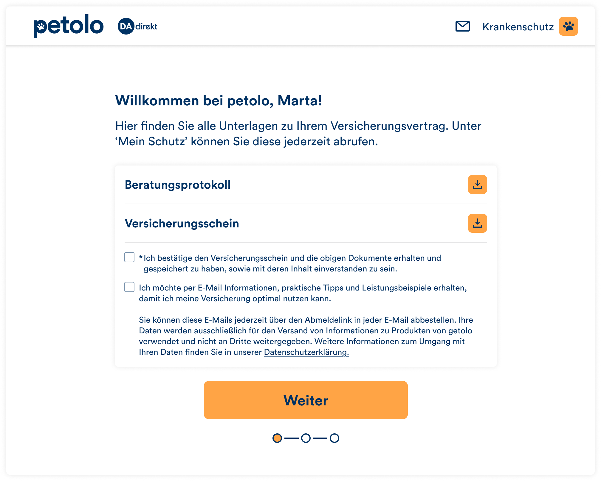
The final onboarding flow has 4 steps, which lead to the ultimate customer activation: uploading their first claim.
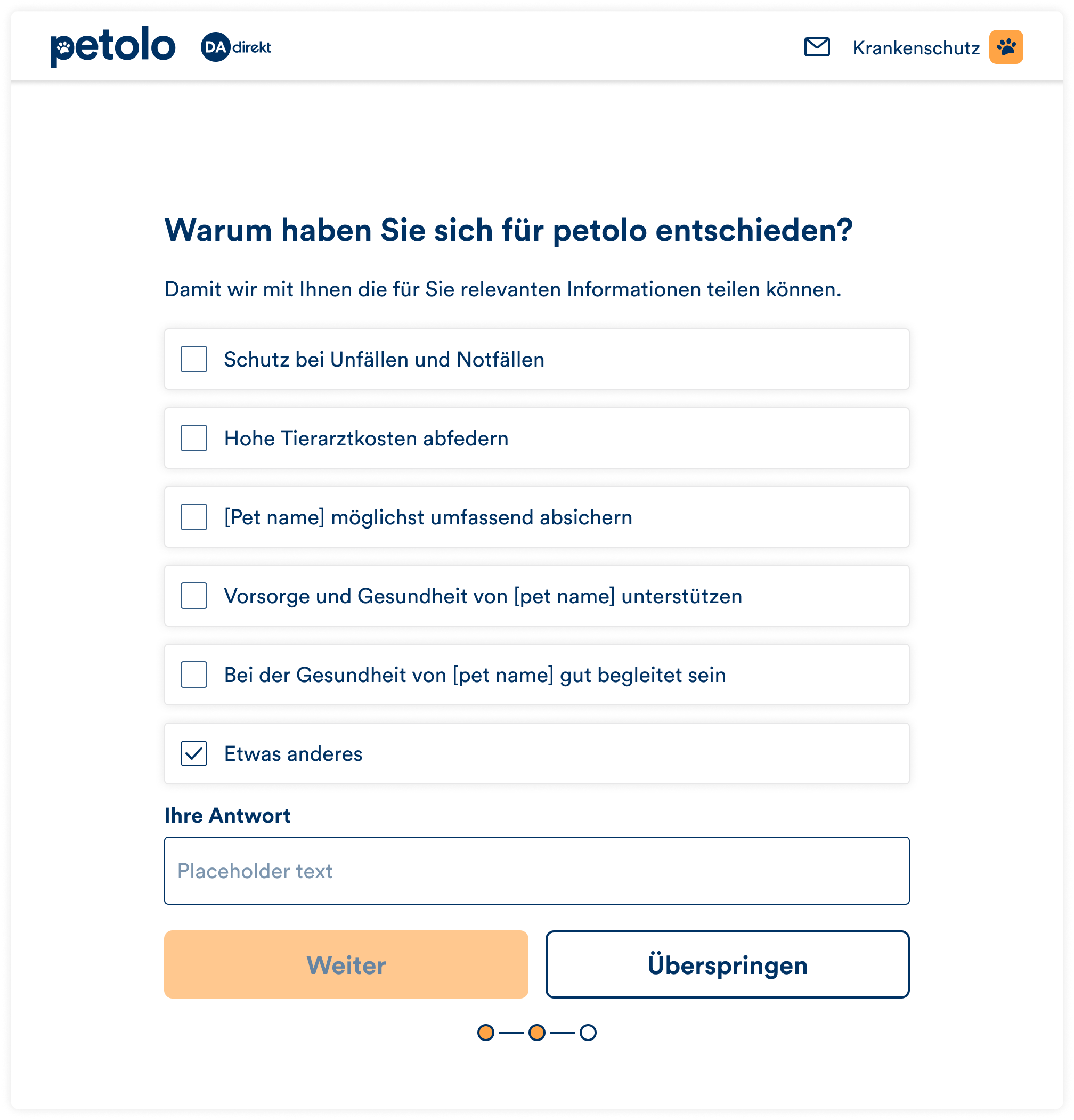
The answer options were refined by our UX Research team based on their observations on what reasons customers had been mentioning throughout various research.
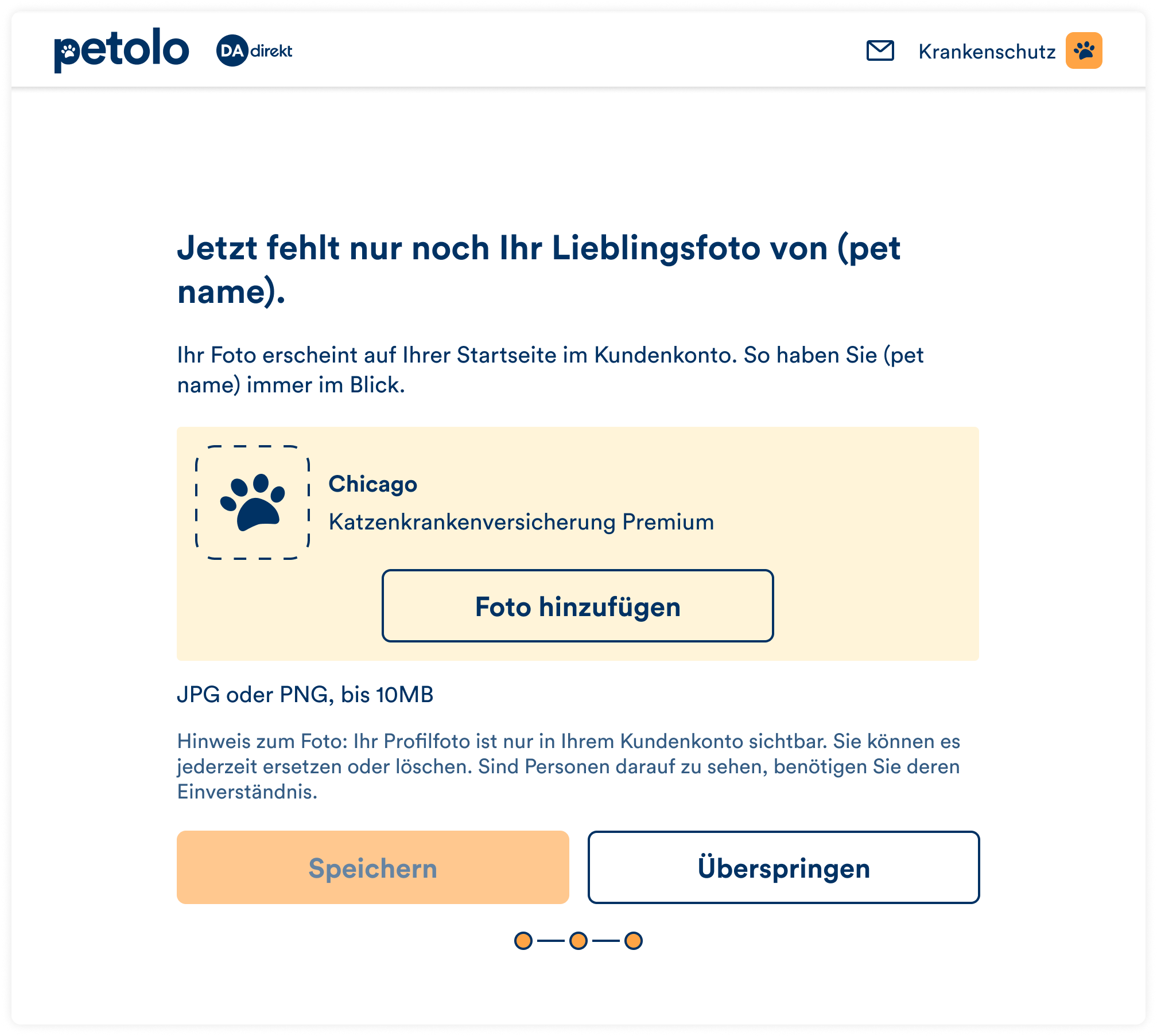
Here I wanted to use the endowment effect, the principle that people value something more highly once they consider it theirs. Placing the pet's photo on the dashboard alsobuilds an emotional connection to an otherwise dry, formal product.
It includes 3 items:
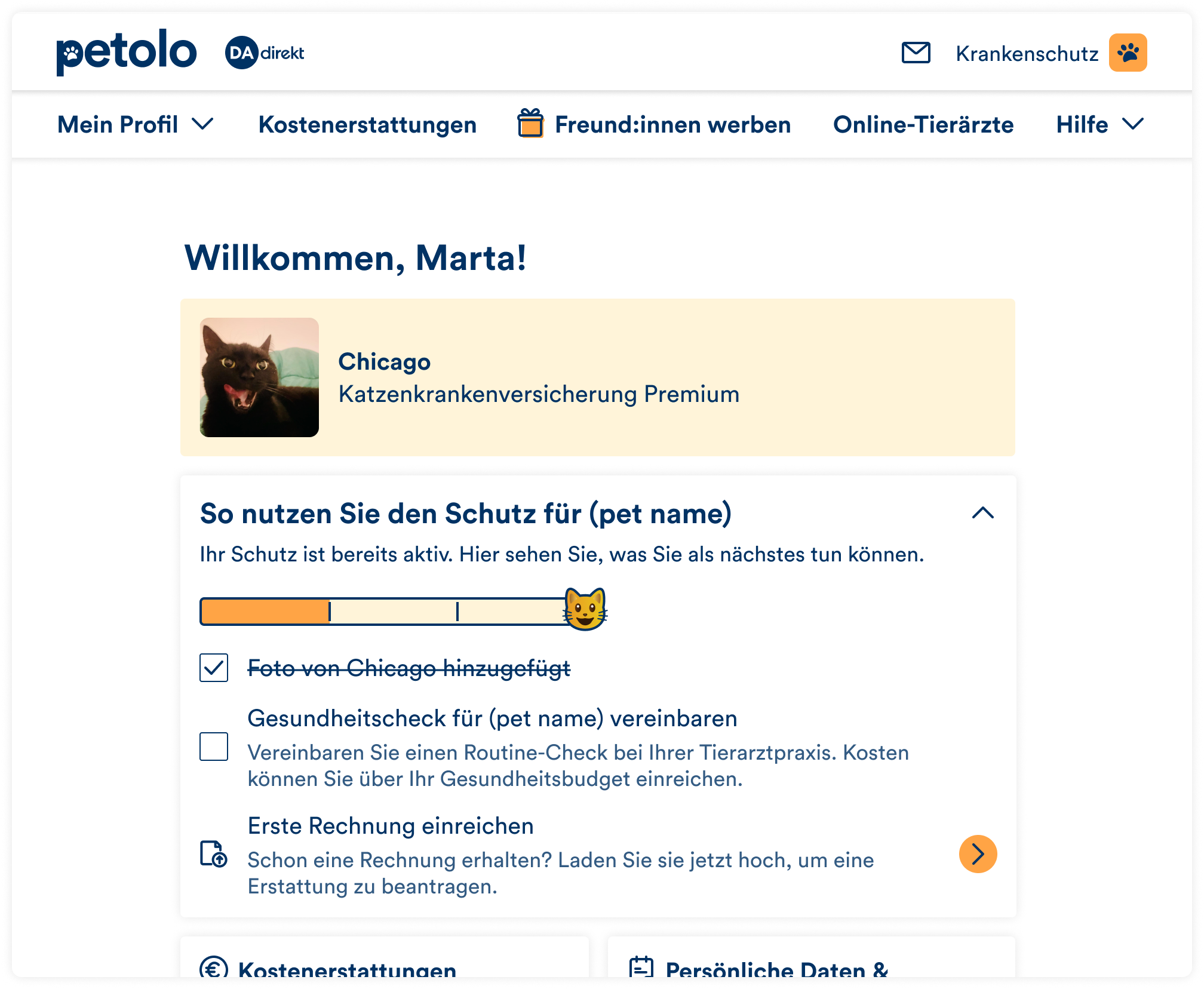
The flow is currently in development, so it isn't possible to determine its final impact yet. We'll measure success by rolling it out to a subset of customers first and tracking the cancellation and withdrawal rate within the first 3 months, along with the rate of prevention claims.
This project taught me how keeping asking questions helps discover the real underlying problem. "Too expensive" could easily be misidentified as pricing issue until we asked what was underneath it. That way, we discovered that customers hadn't experienced enough of the product to know it was worth paying for. It is possible that this problem could be solved without changing the product itself, but by changing the way it is presented.
I am currently looking for new challenges in Berlin or remotely.
If you'd like to collaborate, send me a message and I will reply within 2 business days.
You can also drop me a message on LinkedIn or call me at +49 (0) 176 72580153.